Urban Peaks Rental Company
A welcoming brand identity design for a personable start-up rental company located in Asheville, NC.
CLIENT BACKGROUND
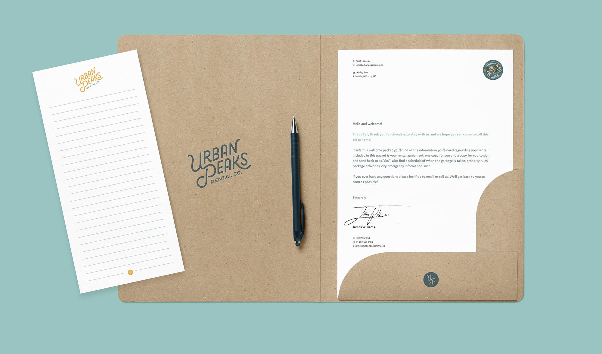
Urban Peaks is a start-up rental business located in Asheville, NC, focused on families, and finding them a welcoming space they can call home. They needed a professional yet personable visual identity system to communicate that. This also included various printed materials to promote their business and welcome new families into their homes.
While Urban Peaks is located in Asheville, NC their goal is to expand to other parts of the US to not only include residential rental properties, but expand into RV rental, and small business properties. They are inspired by the mountains surrounding Asheville, which became a key component of their identity.
PROJECT GOALS
Create a consistent, professional brand identity system that will facilitate Urban Peak’s personable and welcoming personality.
Build the identity system into various promotional materials
SERVICES PROVIDED
Brand Consultation
Identity Design
Brand Guidelines
DELIVERABLES
Logo System
Brand Usage Guidelines
Supporting Brand Assets
Logo & Color System
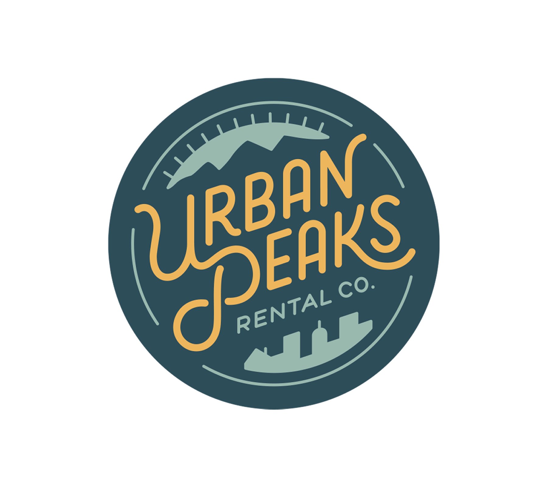
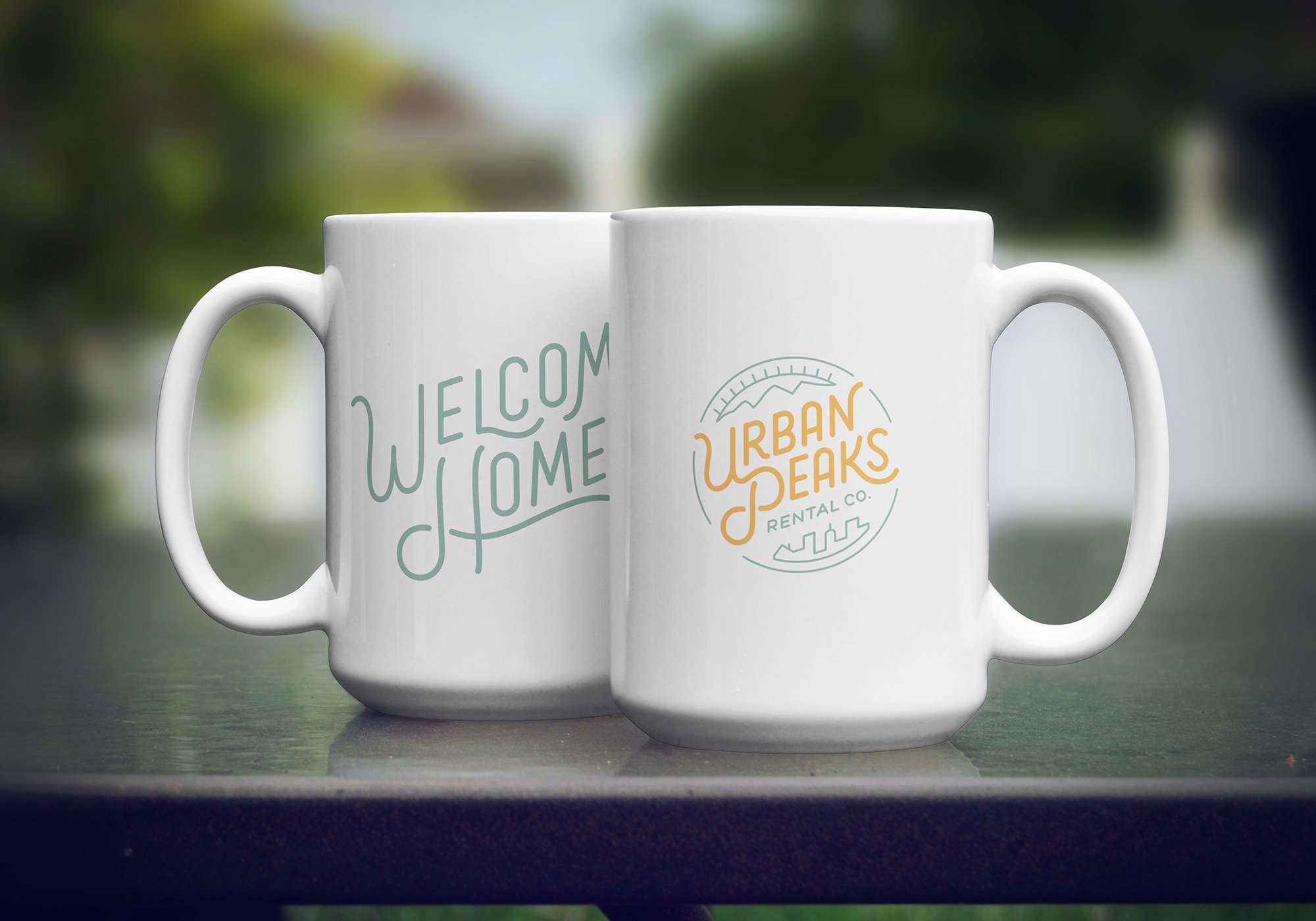
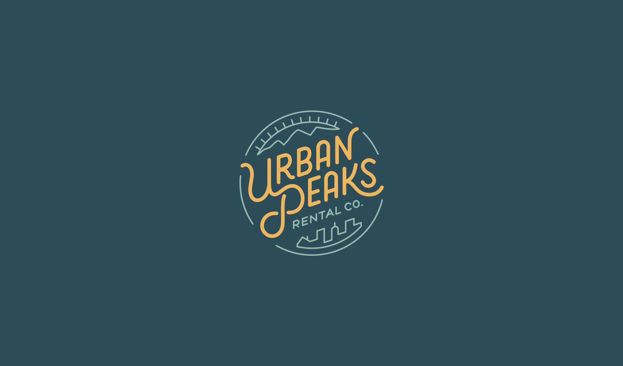
A big inspiration for Urban Peaks was their location. The way Asheville is surrounded by the Blue Rudge Mountains became a key component of its identity. Due to the company’s goals, the identity was built to be very flexible and consists of a few different lockups; the primary logo, logotype, and monogram. Each is used depending on application size and situation.
THE PRIMARY LOGO
The primary logo is the main representation of Urban Peaks. It includes every element of the identity: mountains, sun, cityscape, and logotype.
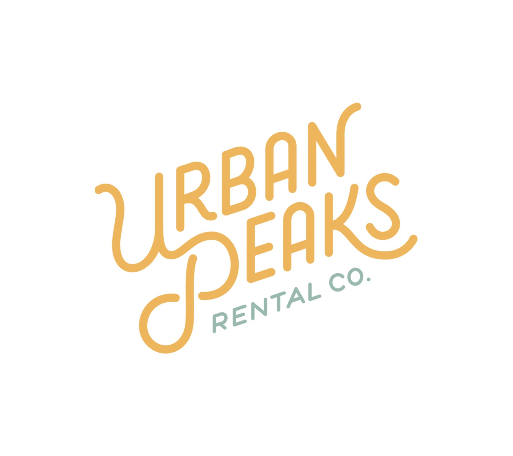
THE LOGOTYPE
For some situations where the primary logo is too detailed or the application area is smaller, the logotype is the best option. This includes an option with or without the “RENTAL CO.” subtext.
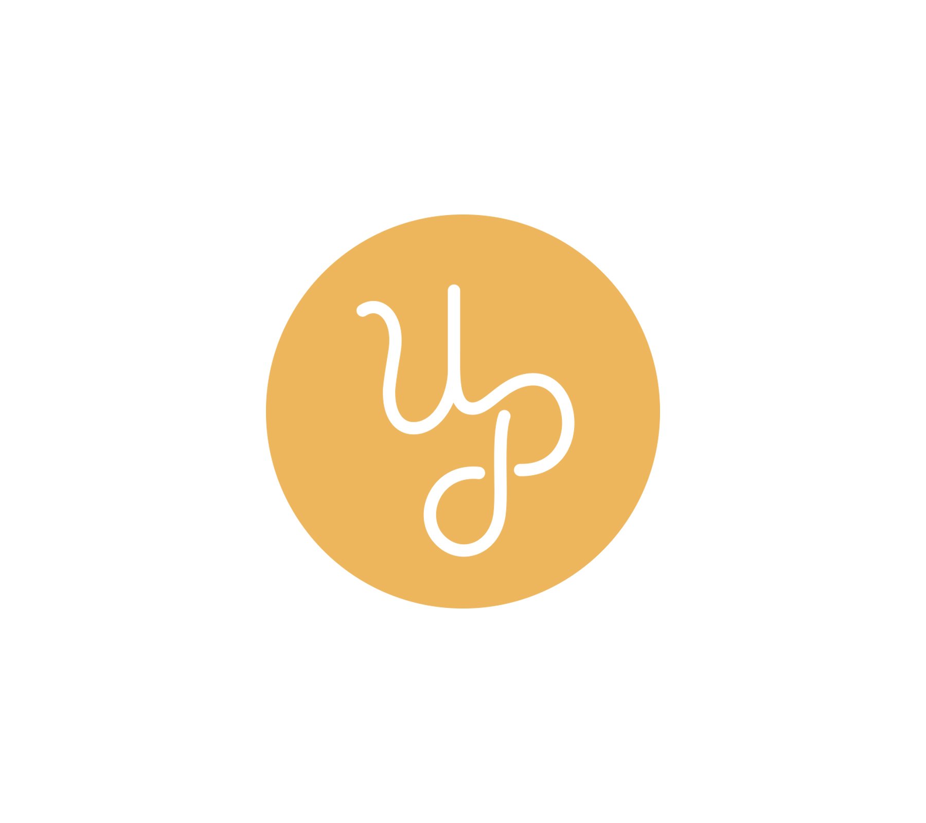
THE MONOGRAM
The monogram works best for smaller or supplemental promotional applications such as social media, stickers, pencils, etc.
THE COLOR SYSTEM
Also pulling inspiration from the location, we chose colors that eluded to layered mountains and the sun — welcoming and inviting colors. The main brand colors are gold and navy blue, followed by teal, blue, and orange for secondary usage.

Supporting Assets
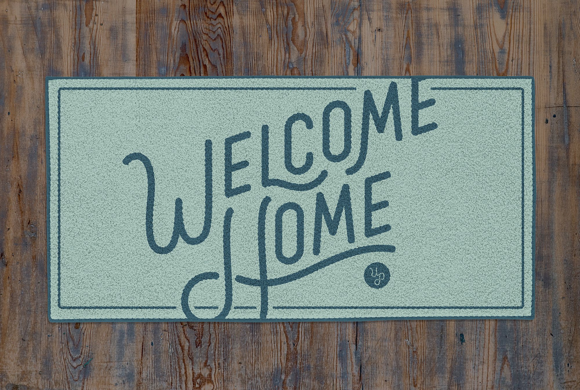
To support Urban Peaks as they launch, we developed custom “Welcome Home” lettering for promotional materials that could be build upon later.