
Kennason
Brand identity system redesign for a design research consultancy to communicate a more professional and confident tone.


CLIENT BACKGROUND
Kennason is a design research consultancy focused on Human Factors Research, strategy, and User Experience Design (UX), helping organizations understand how to make their products and services more helpful, easy to use, inclusive, and enjoyable for users. They work with a variety of clients to help identify user interaction problems with products or software. In addition, they provide their clients with strategic planning and recommendations for more user-friendly and higher-quality experiences or services.
PROJECT GOALS
Refresh and expand on the brand identity system.
Represent the brand in a professional, confident manner while not sacrificing the personality.
Provide brand guidelines to maintain a consistent visual representation.
Develop multiple print and digital media utilizing the new identity system.
SERVICES PROVIDED
Brand Consultation
Identity Design
Illustration
Motion Design
Print Design
Brand Guidelines
Ongoing Support
DELIVERABLES
Logo Wordmark System
Brand Usage Guidelines
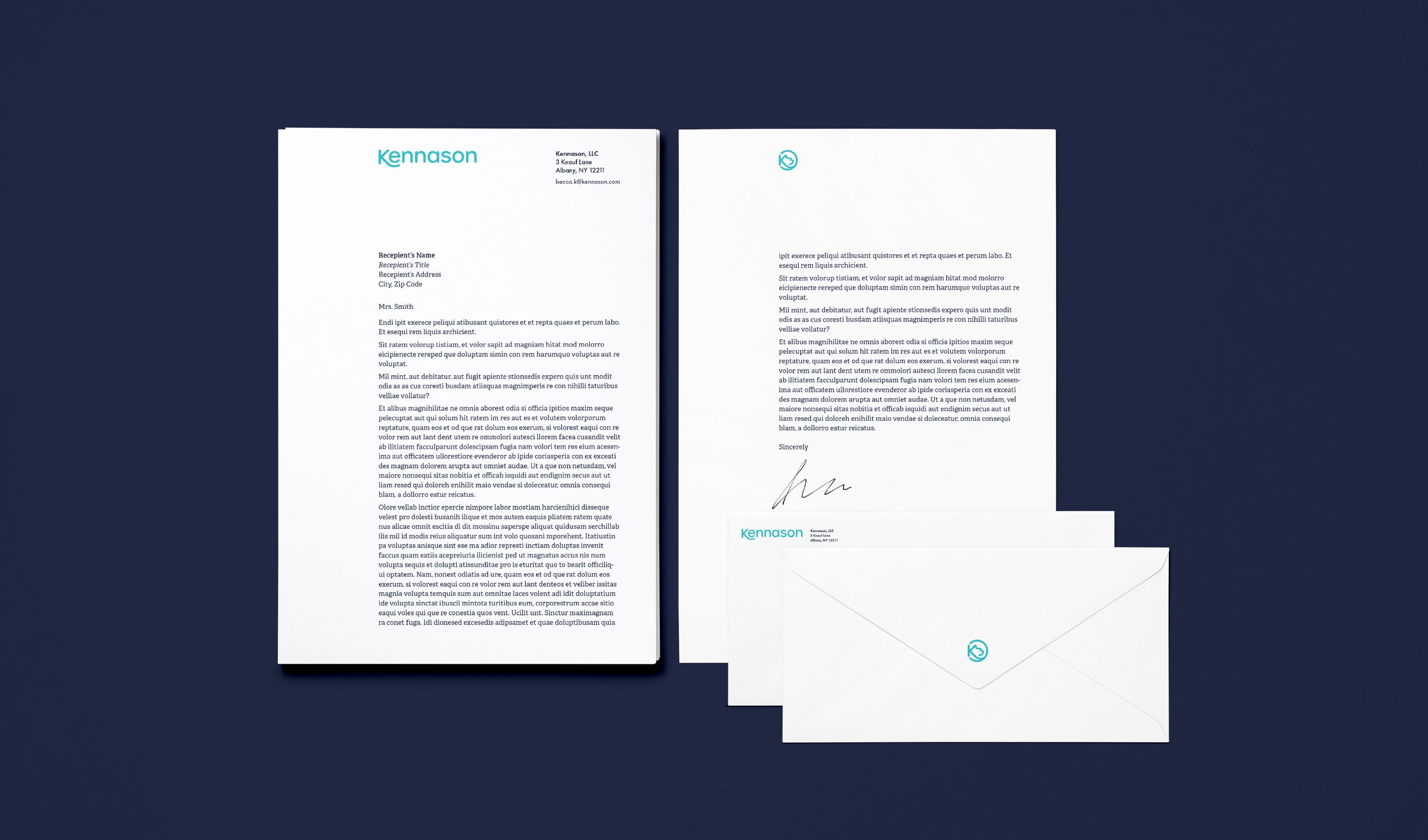
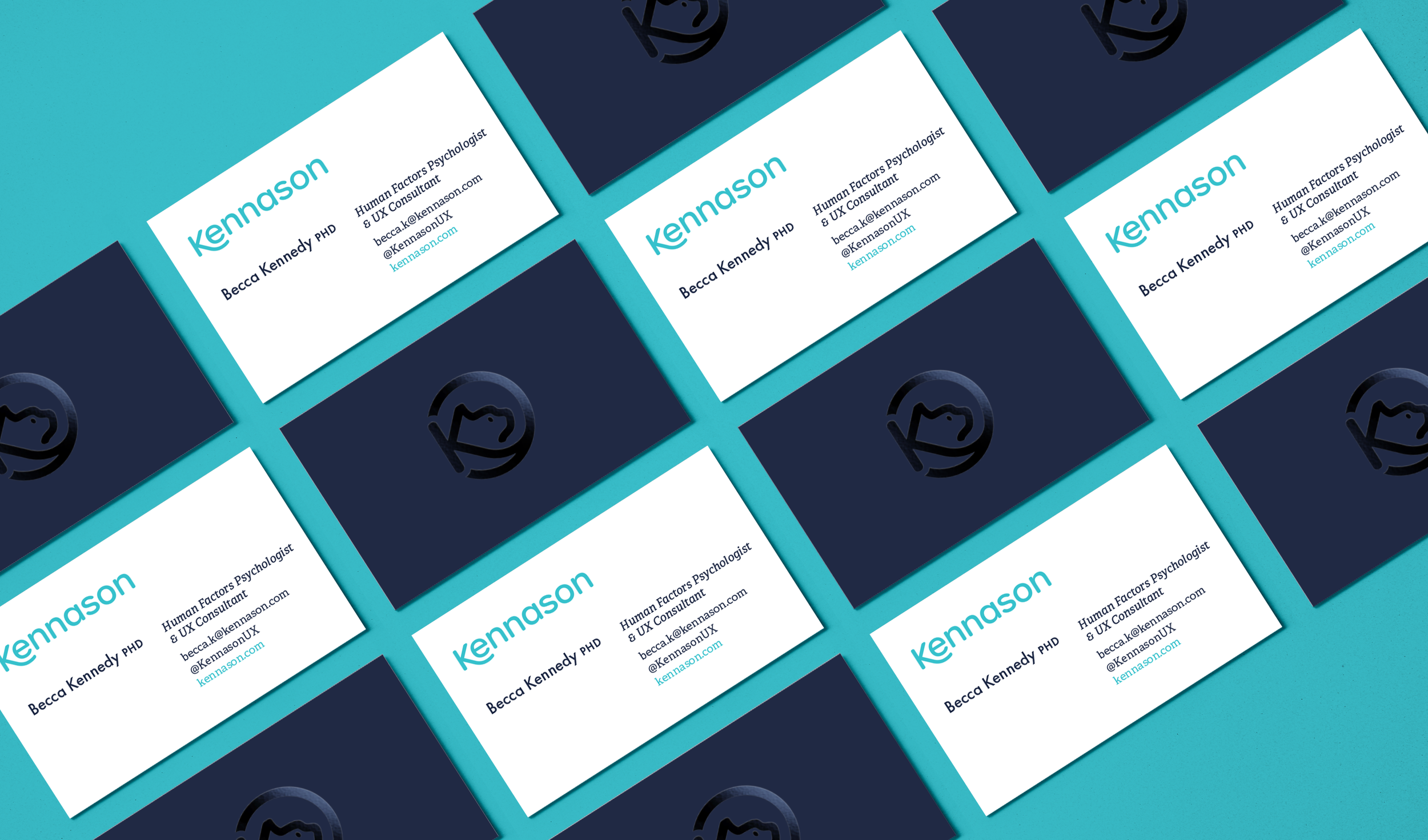
Business Cards
Letterhead
Envelopes
Presentation Templates
Custom Illustrations
Iconography
Motion Graphics
Logo System

Kennason’s original logo included an image of a cat because its founders were proud cat owners. While they were open to other ideas, the cat symbolism strongly connected to what they do as researchers. For example, cats are “cautiously curious” — a trait that researchers require to remove bias from their work. The concept then incorporated space imagery to help suggest the idea of curiosity and exploration.
THE WORDMARK & SYMBOL
The Wordmark uses the font Urbane Rounded, a curved, versatile, friendly typeface with a larger x-height to increase readability. The addition of the tail to the K makes the wordmark more unique. The Symbol combines the K from the wordmark and imagery of a cat face to create the suggestion of an astronaut helmet — containing the symbol in a clean, circular, easy-to-use shape.
When combined, the Symbol and Wordmark create a Lockup suitable for various applications. Providing Kennason with a logo system allows their identity to work across multiple types of applications and customer touchpoints while still being cohesive and identifiable.

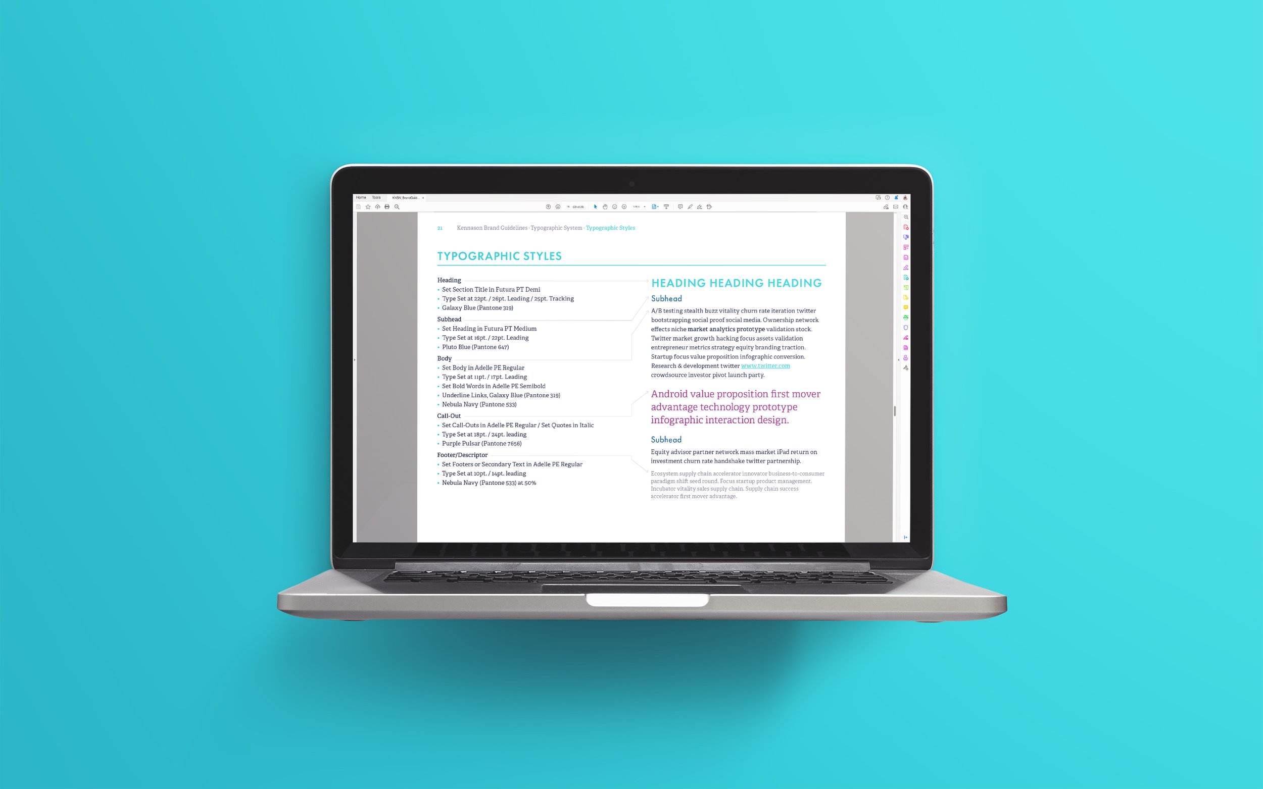
Typography & Colors
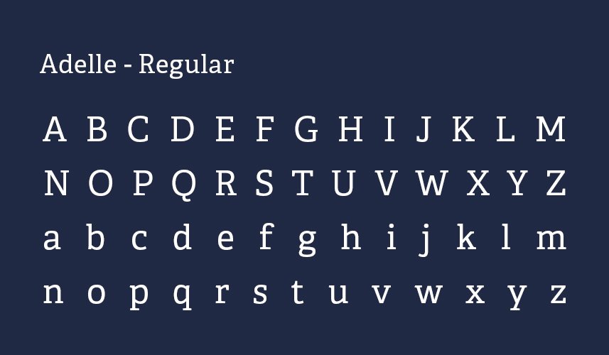
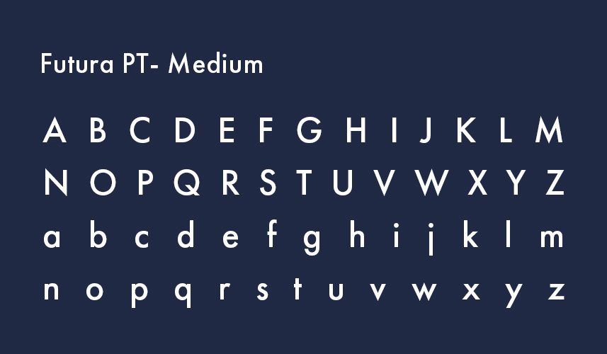
Initially, Kennason used Futura, a Bauhaus-inspired, classic geometric typeface. Because of its geometry, it looks professional but can come across as cold. A multi-purpose friendly slab serif called Adelle was added to the system to add warmth.
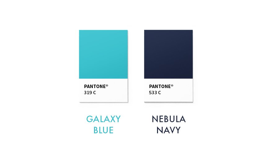
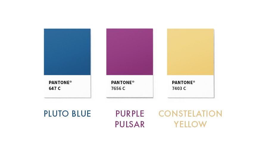
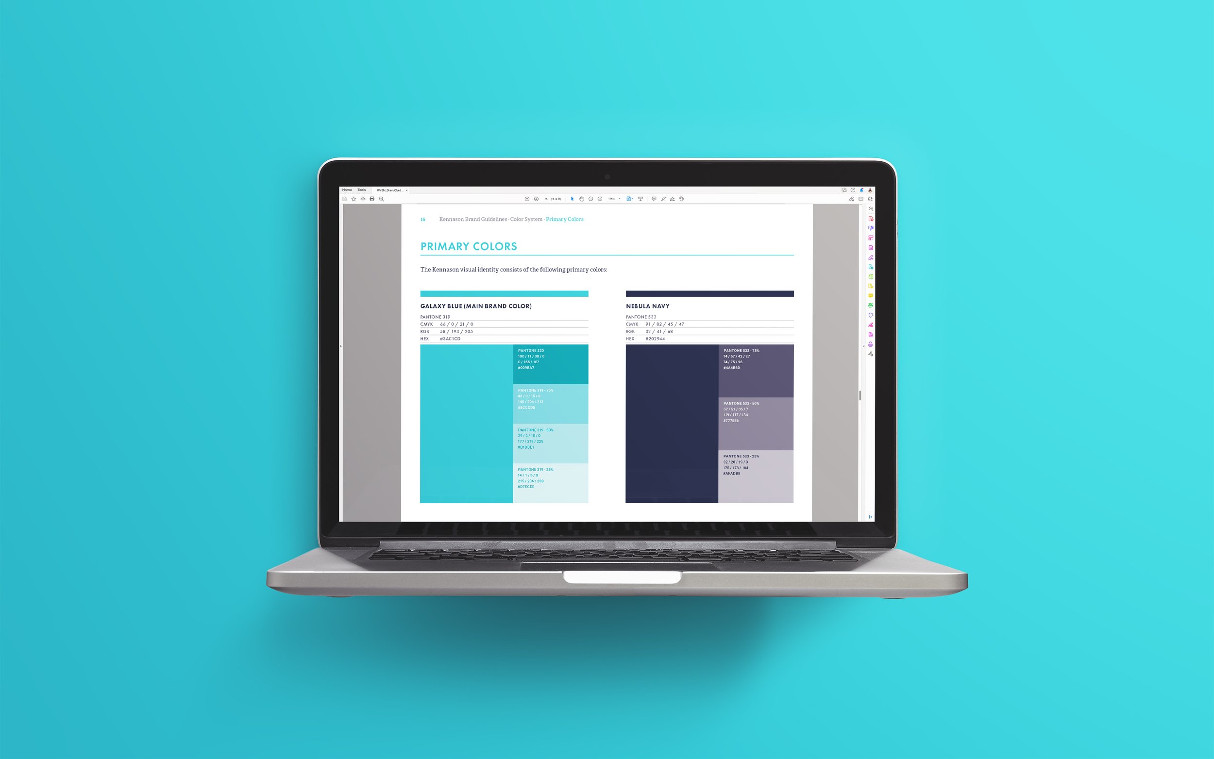
The color palette is split into primary brand colors and secondary accent colors. The logos are only used in the primary brand colors, black, or white, to ensure consistent usage. The secondary colors are used for other marketing needs.
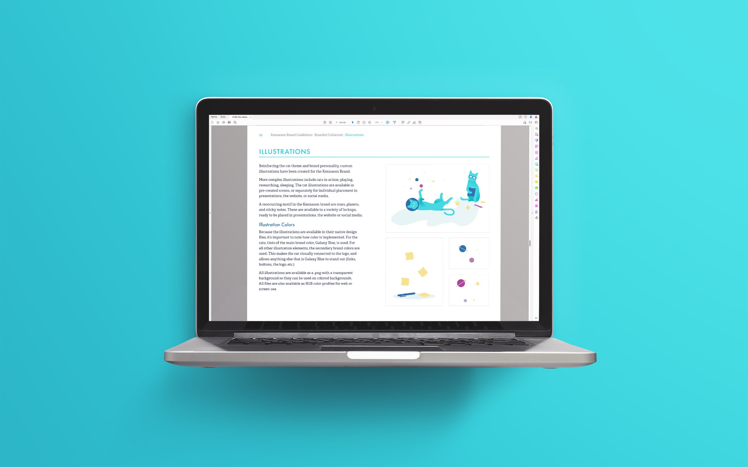
Custom Illustrations

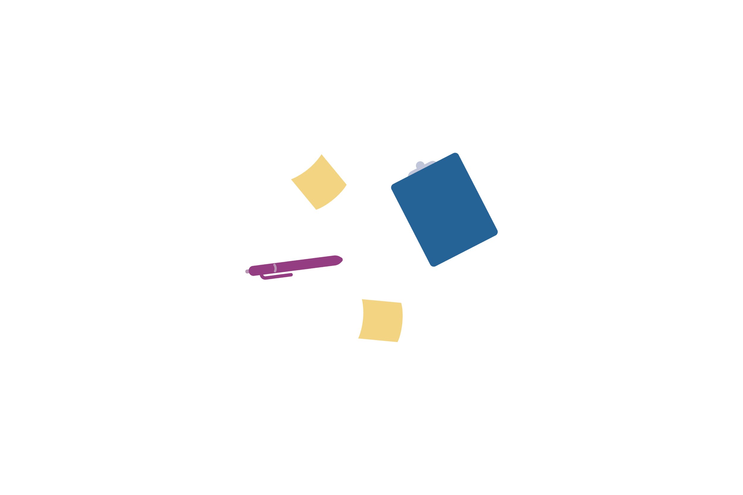
To develop the brand further and continue giving the brand more personality, custom illustrations were created for Kennason to use in a variety of situations. Cats in humorous stereotypical research–like situations added a more relatable tone to the brand while still coming across as professional. Along with the cats, floating stars and planet shapes were included as filler elements in presentations and on Kennason’s website.


Custom icons for Kennason to use on their website and other branded materials such as reports, proposals, or presentations.
Brand Maintenance
BRAND GUIDELINES
To ensure Kennason maintains their branding long-term, brand guidelines were provided. The brand guidelines included messaging, logo usage, logo file information, all color information, typography, type styles, illustration usage, and other instructions for using their branded assets.
TEMPLATES
Presentation templates were provided to Kennason to help them easily utilize the new brand identity. A professional, serious-toned template was provided for client presentations. A separate, more friendly template including more illustrations for speaking engagements, conferences, or university presentations was also provided. The files contained different possible layouts, illustrations, pre-determined type styles, and all the brand colors were built–in.

"Cinder Design Co. brought our brand identity to the next level, helping us communicate our playful personality with a high level of professionalism. This has been critical for attracting the right clients for our business growth!"
– Becca Kennedy, Owner | Kennason