

Brummer Orthodontics
Brand identity system for an orthodontic practice based in Baltimore, Maryland that balances liveliness, sophistication, and professionalism.

CLIENT BACKGROUND
Nicole Brummer was starting her own orthodontic practice in Baltimore, Maryland. She was seeking to work with Cinder Design Co to develop her visual identity to be unexpected and stand out in Baltimore. We worked with her to develop an identity and marketing materials that represented her lively personality but balanced well with the professionalism of her industry.
PROJECT GOALS
Develop a brand identity system.
Communicate the client’s lively personality, while still representing the practice in a sophisticated and professional manner.
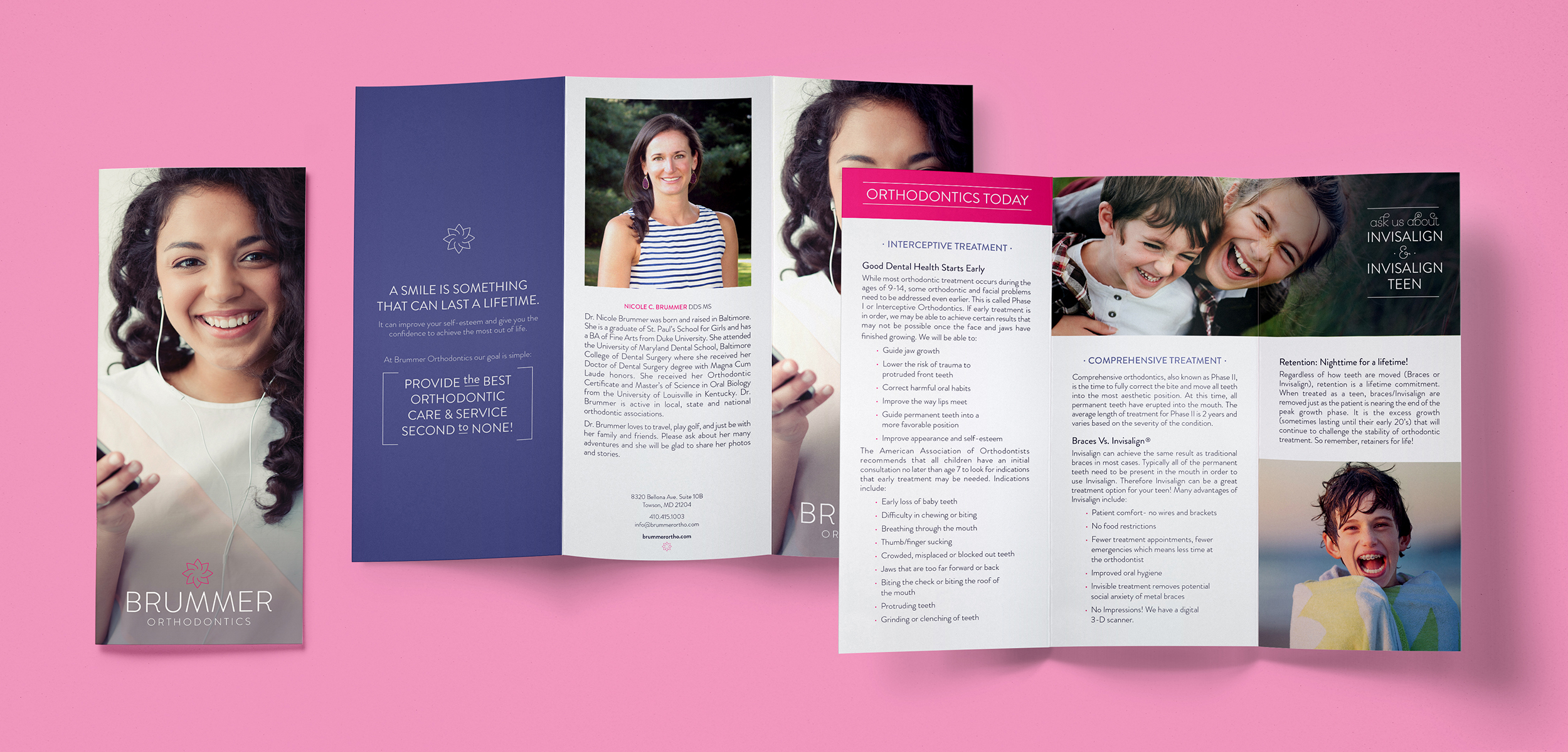
Develop stationary and other marketing materials to promote the practice utilizing the new identity system.
SERVICES PROVIDED
Brand Consultation
Identity Design
Print Design
Brand Guidelines
Marketing
DELIVERABLES
Logo System
Brand Usage Guidelines
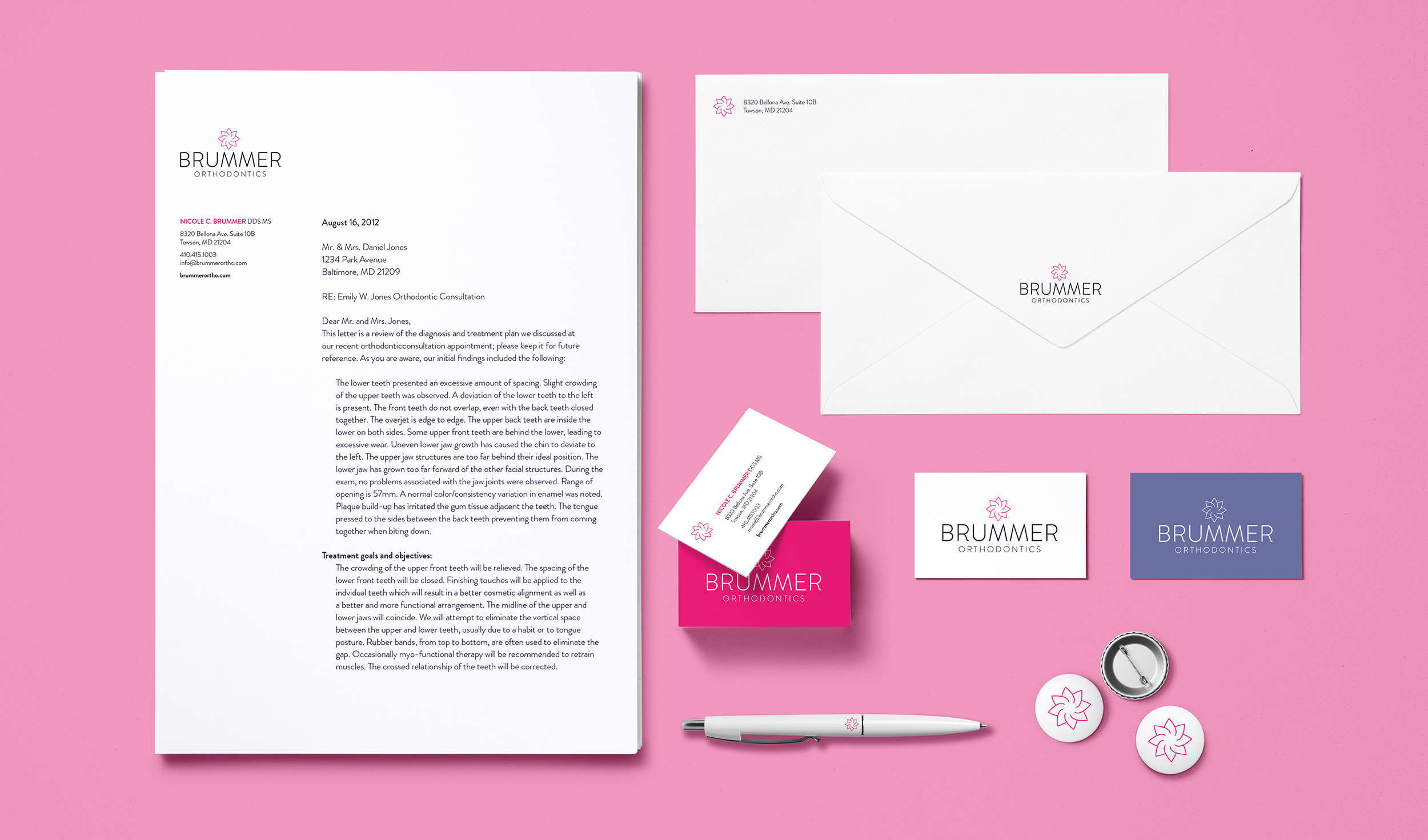
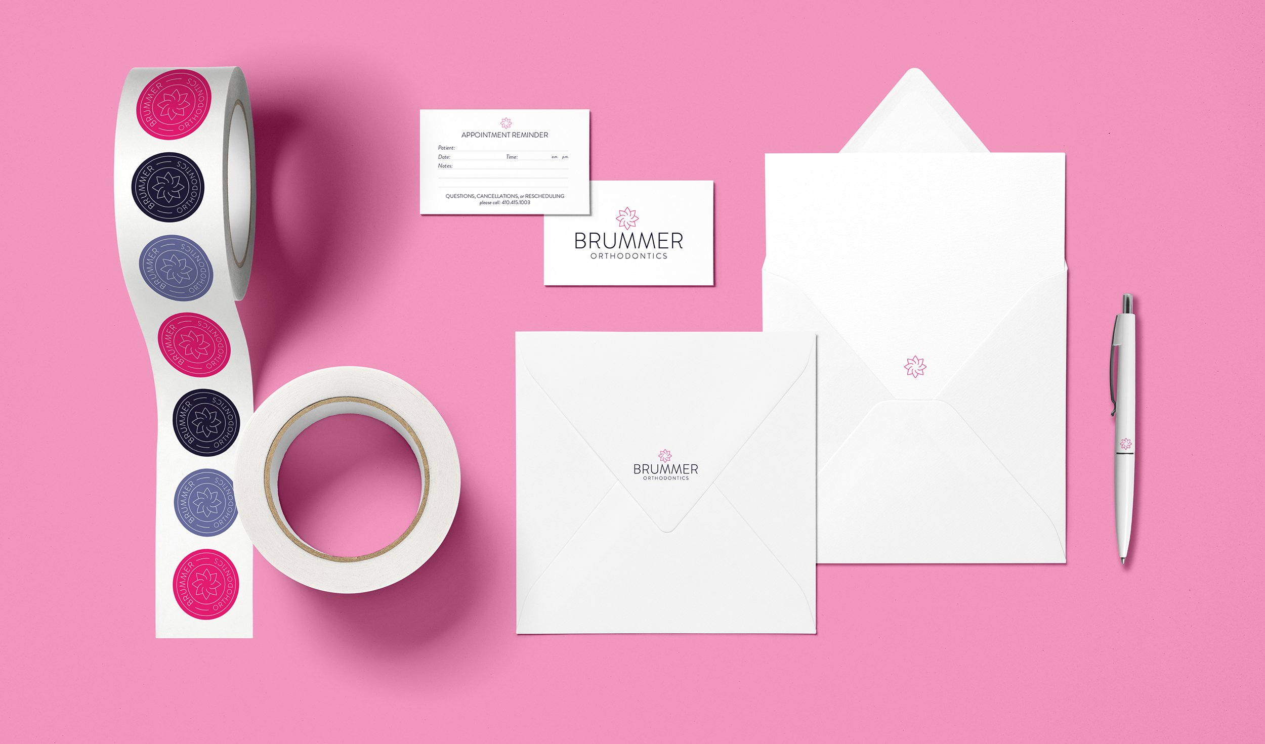
Business Cards
Letterhead
Envelopes
Hand Lettering
Iconography
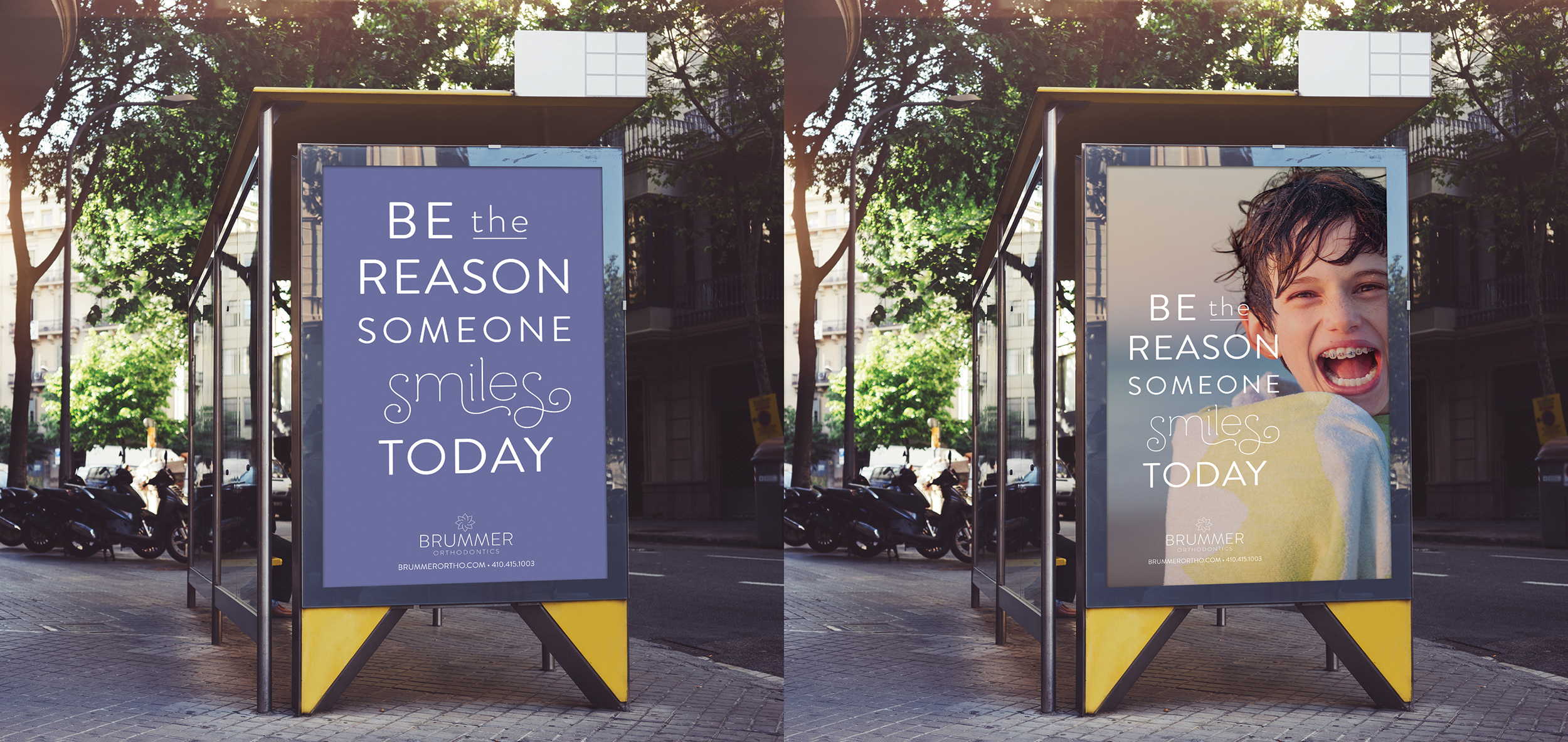
Advertisements
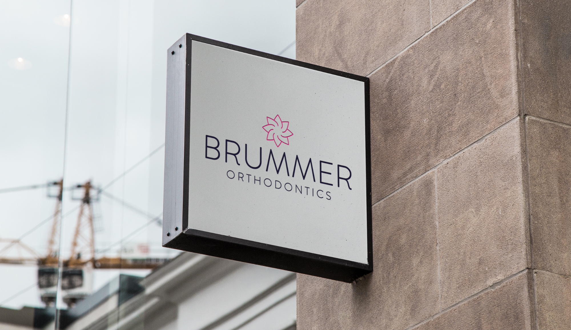
Logo System

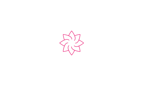
To create an identity that best represented Nicole and her business, we began understanding her goals and researching the core of her practice. Our research started with a focus on the history of dental alterations, connecting with ancient Egypt. Our research uncovered the meaning behind the lotus flower. Throughout many cultures and religions, the lotus is related to beauty and rebirth and represents spiritual victory. This was a fitting theme as the client left another practice to begin the journey of owning her own practice. After many conversations with Nicole, beauty & confidence became the brand values.
THE WORDMARK & SYMBOL
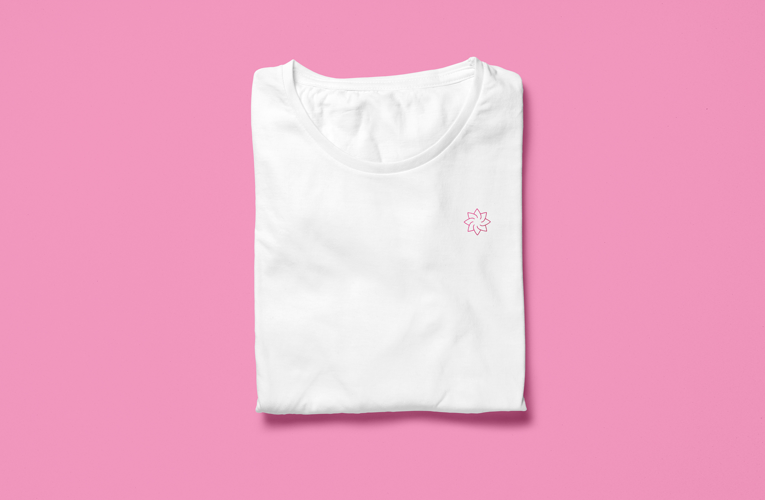
We worked with the lotus imagery to develop a mark that creates a blooming motion to represent the brand values. The wordmark was an altered variation of Brandon Grotesque.
Typography & Colors
The main typeface selected to accompany the lotus symbol was Brandon Grotesque, geometric-style sans serif — due to its legibility, simplicity, and elegance. It contains a wide range of weights, and there is also a Brandon Text family available which is great for long-form text. The Rs of the wordmark were altered versions of the original Brandon Grotesque design, adding more drama to the tails and mirroring shapes from the lotus symbol.
We worked closely with the client to develop the color palette. Nicole was keen on using hot pink as the main brand color but needed additional colors that would contrast and work well together in the professional space. We added a contrasting navy, a neutral purple, and soft grey to balance the lively pink.


Marketing
To help Nicole stand out even more in the orthodontic space, she needed the marketing to communicate everything we’ve developed. Simple smile-related quotes were selected and set in Brandon Grotesque and Mandevilla – a whimsical fun typeface to contrast the simple elegance of Brandon Grotesque. These typographic illustrations were placed over photos depicting kids or young teenagers with braces. This treatment was carried out across various advertisements and print materials.
"I could tell that Cinder Design cared about my business and they wanted to make sure I was happy with every detail."
– Nicole Brummer, Owner | Brummer Orthodontics