Chalk Lettering Process
We recently worked with local waffle shop, Iron Roost, to redesign their drink menu boards. The shop has been around for a couple years and they've been wanting to up their menu game for a while. In 2016 we worked with them on an illustration for a Christmas postcard, which led to working with them to re-design their menu boards.
While you see chalk art and lettering all over the internet these days, we think it's important to share the thought and process that went into creating these menus.
PROJECT GOALS
Below is an image of their original menu boards. The major goals of the redesign were that the information needed to be better organized, readable, and on brand. The space is rustic and in a very historic part of town with small tourism shops, eateries, and antique shops. Iron Roost is all about sourcing local ingredients or products, and being homemade with love.
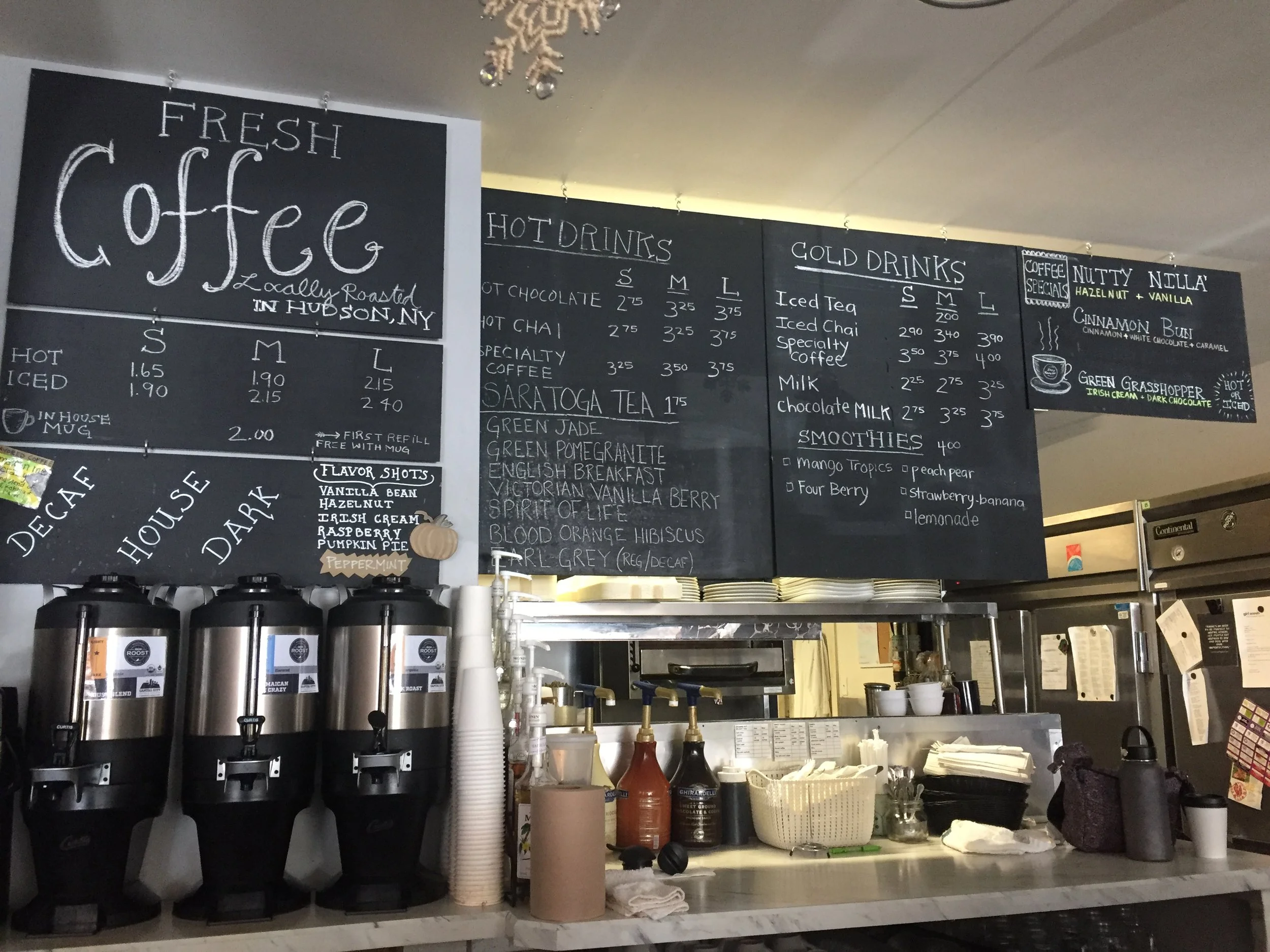
The original menu boards.
SKETCHING
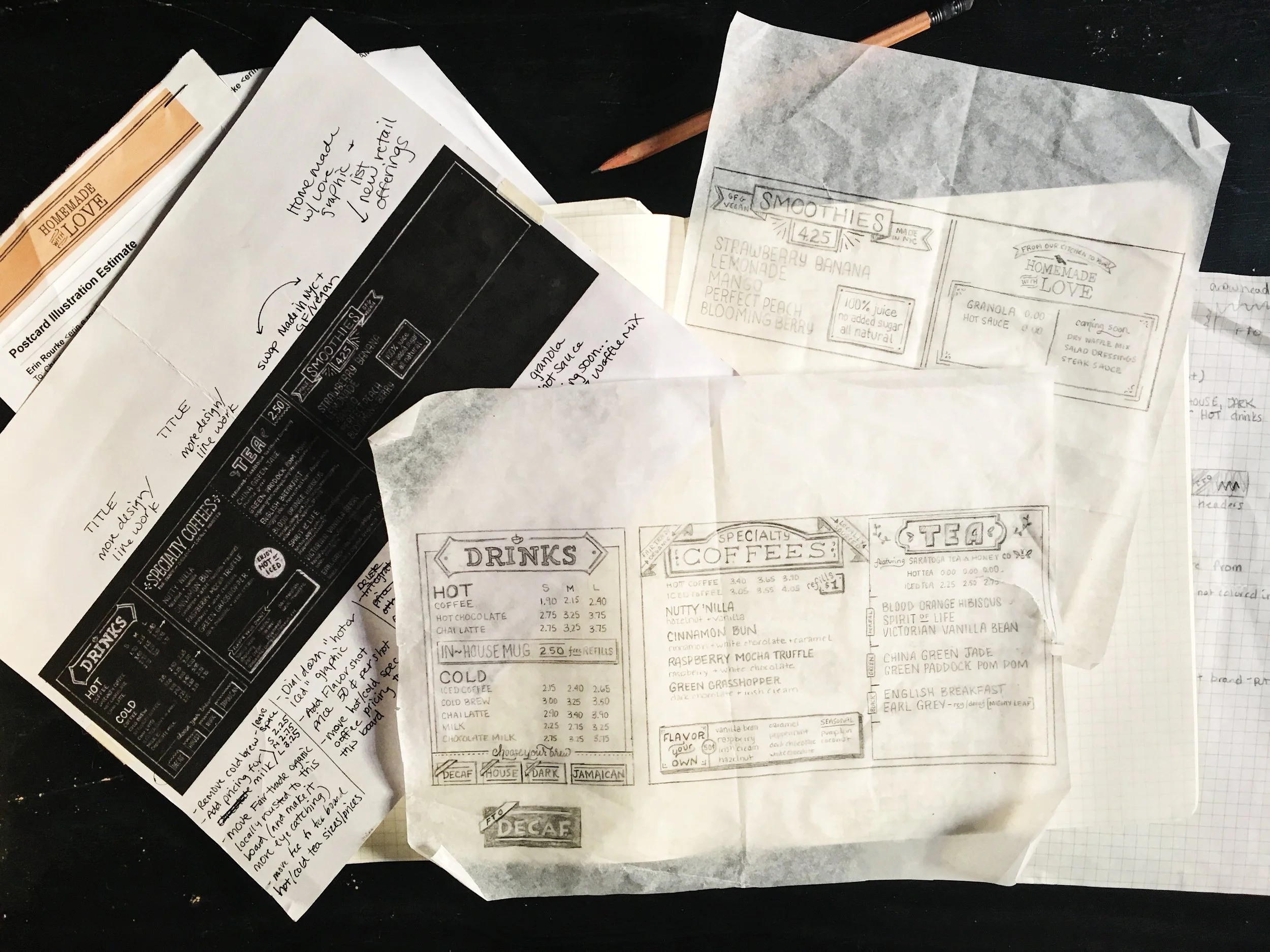
When working with this much information, sketching is VERY important. We met with Iron Roost to discuss what information was most important; what their customers ask about, how their customers behave, what they order, what items bring in the most revenue, what items change seasonally, what items they want to promote, etc. All these inquiries dictate the hierarchy and how the content is organized.
Our client relationships are very collaborative, so we met with Iron Roost multiple times to discuss ideas and changes. Nobody knows their company and customers better than they do so it's important for them to be very involved. Below are some of the sketches, notes, and revisions for this phase of the project. We worked with tracing paper because it allowed us to see a grid underneath the paper without having to erase lines. We scanned the sketch and inverted it in photoshop, so we (and the client) could envision how the design will look on a chalkboard and what information will stand out the most. This influenced a lot of decisions such as the bottom of the main "Drinks" menu, type treatments, decoration, and content hierarchy.
CHALK
After the content hierarchy, type styles, and decoration were nailed down in the sketches we moved onto the chalk boards. For the actual chalk drawing, we drew a lot of guides, sharpened a lot of chalk, and did a lot of erasing.


A few tips we have if you find yourself involved in a chalk project:
"Season" the board first. We recommend rubbing the entire board with chalk and erasing it. This way, when you erase guides later it will blend easier with the rest of the board. It also makes the board look used which may or may not be appropriate depending on the project. The rustic quality seasoning gives was right for this project.
Limit the dust. We recommend using Anti-dust chalk. This is extra important if you're working indoors. This won't prevent dust completely, but it makes a big difference, especially when you season the boards and do a lot of erasing. This is the chalk we use.
Sharpen the chalk in bulk ahead of time. Chalk is soft and gets dull fast so if there are sharpened pieces already, it saves a lot of time. All you need is a pencil sharpener that has an oversized hole. Also, the sharpening blades will get dull so have a small screwdriver handy to switch the blades. To limit the mess, we also recommend something that has a compartment to catch the chalk dust. Something like this dual pencil sharpener will work great. Take the sharpening slow. Nothing is more frustrating than the chalk breaking in the sharpener.
Use a chalk holder. Having that extra length and weight to hold onto the chalk helps stabilize your hand so you get straighter lines, more control, and can push harder allowing for a darker line. This is the holder we use, but Amazon has a lot of options.
Use Q-Tips and a shammy/rag for erasing. Getting detailed is important, but can be difficult with chalk. Q-tips are great for erasing little mistakes or guide lines, and some kind of shammy or rag is handy for erasing everything else (especially fingerprints).
Here is a timelapse process video for the biggest board. You can see how important having guides is, and how much erasing happens.
Even after we moved onto the chalk there were changes we needed to make. You'll notice in the timelapse that the final hanging board has some alignment changes. This is why guides are very important when working at a large scale. If one guide is off or missing it can have a domino effect on the rest of the guides which will cause a lot of reworking later.
Sealing the chalkboard doesn't work. We researched different ways to seal the chalkboard, but nothing worked well. We worked on the boards off-site so we knew in order to transport them we'd need to seal them in some way. We tried doing a few light coats of both fixative and matte gloss spray paint but nothing ultimately seals in the chalk. The chalk still came off and smudged. We also tried using thicker coats of sealant, but when chalk gets wet it fades and blends in with the background. Having a very bright white was important for the readability, so in the end, we didn't fully seal the boards. Instead, we covered them completely with sheet plastic, and because one of the boards was 8 feet long we rented a U-haul to transport them. There were only minor touchups when we got them to the shop, but we were much happier having a bolder white in the end.
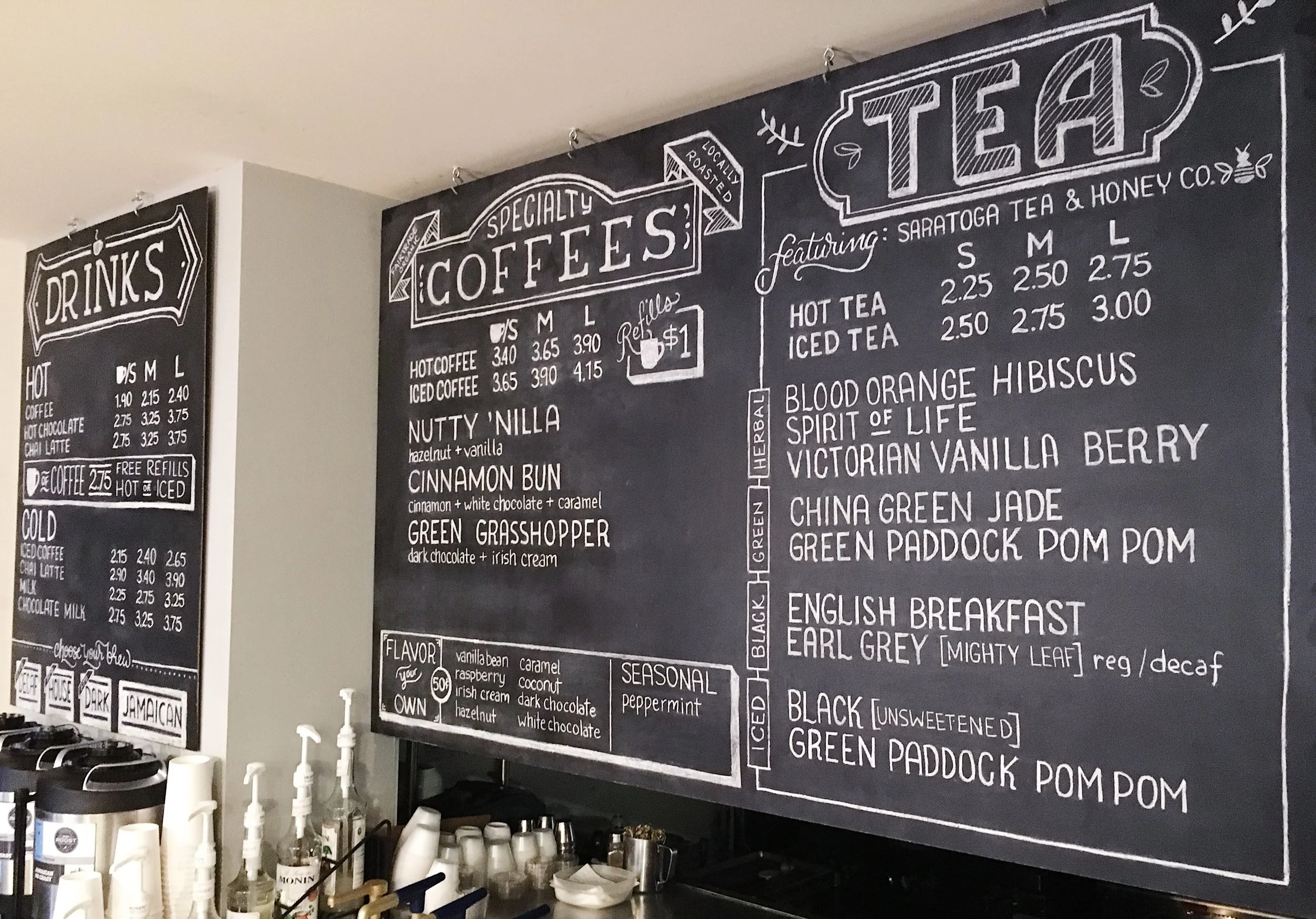
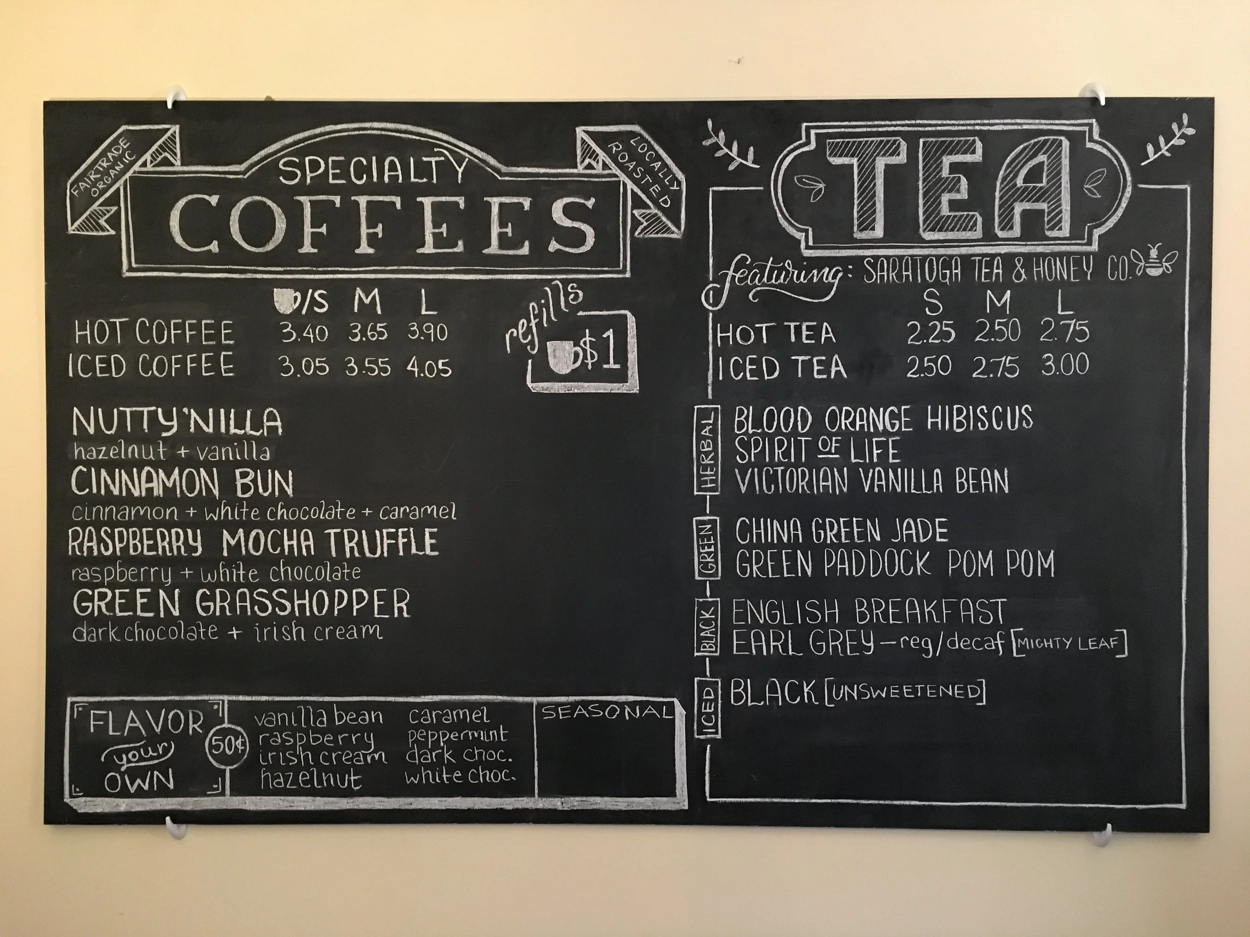
Final boards hanging up in Iron Roost. There were three boards in total, the two shown above and another hanging to the right.
In the end, it was a challenging and fun project.
If you have any questions about your own chalk project or would like to collaborate on a project shoot us an email!